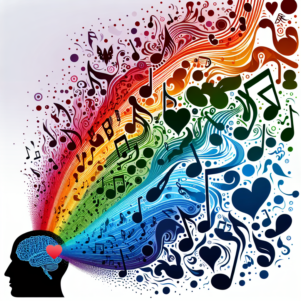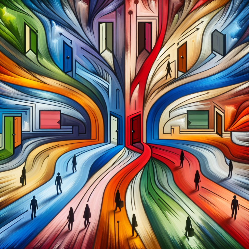
You might think you’re immune to the power of color — that your choices are driven by logic and reason. But research says otherwise. From the clothes you pick to the brands you trust, colors quietly shape your emotions and guide your decisions in ways that are both subtle and profound. Color doesn’t just decorate our world; it manipulates our minds.
Psychologists have long known that color has a direct line to our emotional brain, the limbic system. Red, for example, can trigger excitement or even mild aggression. That’s why fast-food chains often use it — it stimulates appetite and creates urgency. Blue, on the other hand, calms and builds trust, which explains why banks and tech companies love it. But beyond these broad generalizations lies a deeper, often overlooked truth: color meaning depends on context, culture, and personal experience.
Take white, for instance. In Western cultures, it’s associated with purity and new beginnings — the color of weddings and fresh starts. Yet in many Eastern cultures, white is linked to mourning and death. A color that soothes one society can sadden another. Even within the same culture, personal experiences can change what a color means to someone. A person who had a traumatic experience in a red car might feel anxiety around that shade for years to come.
Marketing and design industries have built entire strategies around these subtle color cues. Supermarkets use warm hues in produce sections to make fruits look fresher, and cool lighting in seafood areas to evoke cleanliness. Online retailers test different button colors to see which one gets more clicks — and the difference can be astonishing. One famous experiment by HubSpot found that changing a website’s call-to-action button from green to red increased conversions by 21%, even though everything else stayed the same.
But colors don’t just influence buying behavior; they can also shape how we think and feel in daily life. Studies show that students perform better on detail-oriented tasks when surrounded by blue tones but are more creative in rooms with a touch of yellow. Athletes wearing red uniforms have been found to win slightly more often, perhaps due to the color’s association with dominance. And in hospitals, pastel greens and blues are chosen not just for aesthetics but because they lower blood pressure and heart rate.
There’s also the curious phenomenon of “color-temperature” perception. A room painted in cool colors like blue or green can make people feel physically cooler, even if the temperature hasn’t changed, while warmer tones like orange or red can make a chilly space seem more comfortable. This small psychological trick is even used in interior design to adjust mood and energy — without touching the thermostat.
Even food doesn’t escape color’s influence. The same drink will taste sweeter when served in a pink cup and more bitter in a black one. Chefs and advertisers exploit this constantly: yellow packaging can make a snack seem tangier, while green labels make products appear healthier. Interestingly, some color effects bypass conscious thought entirely. The reason many luxury brands use black or gold is not just for elegance — those hues actually activate brain areas associated with prestige and exclusivity.
In today’s digital world, where attention spans are measured in seconds, color is one of the most powerful tools for communication. A well-chosen palette can make a brand unforgettable, a message persuasive, or a person instantly likeable. Yet the influence goes both ways — just as designers use color to steer us, we can use it to our own advantage. Wearing blue before an interview might help you project confidence; surrounding yourself with green could ease stress during a tough week.
Ultimately, color is more than a visual experience — it’s a silent language that speaks directly to emotion and instinct. We may not always be aware of its voice, but it’s always there, guiding our perceptions and shaping our world in every shade and hue. The next time you reach for a product, paint a wall, or choose an outfit, take a second look at the colors you’re drawn to. They may know more about your decisions than you do.